
Where 2026 Color Trends Actually Belong
(And Where Designers Avoid Using Them)
Est. Read Time: 5–6 minutes
2026 Color Trends: Where They Work (And Where They Don’t)
This guide breaks down how designers actually apply 2026 interior color trends in real homes. Learn where trend colors shine, where they tend to fall flat, and how to use warmth, texture, and comfort to create a space that feels timeless—not trendy.
Editor’s Note
This article is a continuation of Plaza Interiors’ 2026 color trend series, developed with insights from Heather Place, lead designer at Plaza Interiors in Redding, California. While trend forecasts often focus on what colors are popular, this guide focuses on where designers actually use them—and where they don’t. The goal is simple: help homeowners avoid expensive regret and make confident, livable design decisions.
Why Trend Colors Feel Amazing… Until They Don’t
Color trends are fun… right up until they’re not.
You see a gorgeous shade in a styled photo, save it, daydream about it, and then a year later you’re standing in your own house thinking: Why does this feel loud? Why does it look different here? Why am I suddenly annoyed by the exact color I used to love?
If you read our recent post, 2026 Color Trends: Top 10 Designer Picks for Warm, Timeless Homes, you already know 2026 is leaning warm, grounded, and quietly rich. The good news? These colors are absolutely usable. The better news? Designers don’t use them everywhere.
Because the secret isn’t the color itself.
It’s where you put it.
This is the “next chapter” we wish every homeowner had before committing to a trend color in a way that’s expensive to undo.
The Rule Designers Follow
But Don’t Always Say Out Loud
Here it is, plain and simple:
- Trend color belongs in what you can change.
- Timeless color belongs in what you can’t.
- That doesn’t mean your home has to be boring. It means your home gets to be confident. Warm. Layered. Lived-in. The kind of space that still feels like you even when trends shift.
So let’s talk about where 2026 color trends actually shine — and where we almost always recommend keeping things calmer.
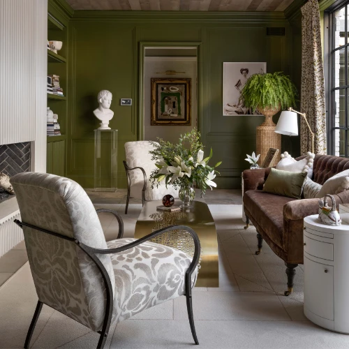
Where 2026 Color Trends Belong: The Flexible, Movable Layers
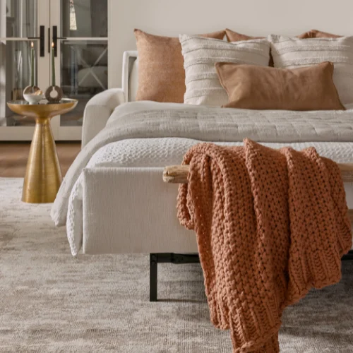
If you want to play with 2026 color trends without painting yourself into a corner, start with the pieces that can evolve with you.
Think:
- Pillows you can swap seasonally
- Throws that bring softness and depth
- Rugs that ground a room without locking you in
- Lamps and art that add color in a way that feels collected
- Accent chairs and ottomans that bring personality without taking over
This is where a cozy home color palette 2026 can feel exciting instead of risky. You get the warmth, you get the mood, and you still have options later.
And if you want that “designer” look without the room feeling overly styled? Build your foundation in warm neutrals, then bring in one richer tone that does the talking.
That’s exactly what we mean when we talk about mixing pieces with intention — not matching everything.
If you love that layered look, you’ll also want to read: Mix & Match Magic: Custom Sofas and Accent Chairs for Living Rooms
Because the right accent chair can do more for a room than repainting every wall.
Where Designers Avoid Trend Colors: The “No-Regret Zones”
This is the part most trend posts skip — but it’s where real design decisions happen.
There are places in your home where trend color can feel thrilling at first… and exhausting later.
We’re talking about:
- Flooring
- Countertops
- Tile you’ll live with for a decade
- Built-ins and cabinetry
- Large permanent surfaces
- Expensive, hard-to-replace finishes
These aren’t the places to experiment.
If you’re investing real money into something that’s difficult to change, designers typically steer you toward warm, timeless backdrops — because those let everything else evolve without you having to start over.
This is one reason warm neutrals continue to win in 2026. Not because they’re “safe.”
Because they’re smart.
They hold the room together while your accents — and your life — change.
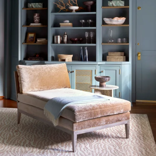
The Best Place to Use Trend Color? Furniture (If You Do It Right)
Here’s where we get a little more nuanced.
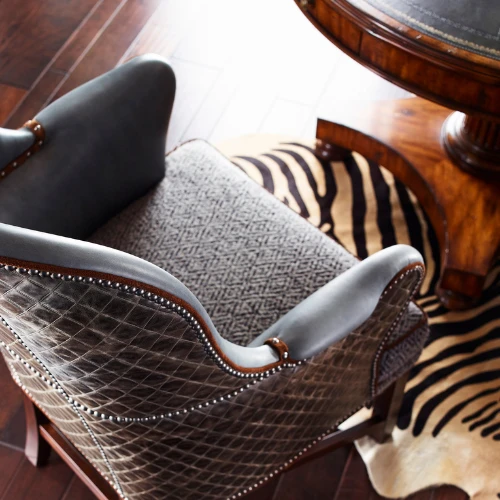
Furniture is a commitment. But it’s also one of the most powerful design tools you have, especially if you’re choosing new, custom, made-to-order pieces.
Trend color works beautifully on furniture when:
- The piece is made well
- The shape is timeless
- The comfort is real
- The color is chosen with your actual lifestyle in mind
A bold chair in a deep, earthy jewel tone? Gorgeous.
An ottoman in a warm, textured fabric that brings depth without shouting? Perfect.
A sofa in a trend color you’re not sure you’ll love in three years? That’s where we slow down and ask better questions.
One of our favorite approaches is the “one statement piece” rule:
Let one upholstered piece carry the richer color, and keep the rest grounded.
It’s why custom furniture is such a sweet spot for 2026. You can bring in that warmth and depth without turning your whole home into a trend experiment.
If you’re curious what custom can look like (and feel like), start here: Custom Furniture & Upholstery
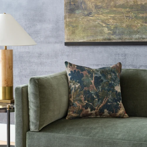
Color Isn’t Just Visual. Comfort Changes How It Feels.
This is where design becomes real life.
A color trend can look completely different depending on:
- Fabric texture
- Sheen vs. matte finish
- Cushion shape and construction
- Seat depth
- How the piece actually gets used
A deep teal, for example, can feel moody and elegant in a soft, plush fabric — and harsh or “too much” on a slick, flat surface.
And comfort matters more than people expect.
A trend-colored chair that’s deep, cozy, and genuinely comfortable becomes the seat everyone fights over. That color becomes associated with rest, comfort, and good moments.
But if the chair looks great and feels stiff? The color can start to feel like décor you’re tiptoeing around.
This is one reason we’re selective about the manufacturers we bring in. When you’re choosing custom upholstery, you’re not just choosing a color — you’re choosing how that color lives with you.
That’s where makers like American Leather and Lee Industries stand out for comfort-forward construction. It’s where Hancock & Moore and Century Furniture shine when you want that balance of craftsmanship and timeless silhouettes. It’s where Huntington House and Flexsteel can be a great fit for real-life durability and everyday use.
The point isn’t the label.
The point is: if you’re bringing trend color into your home, it deserves to live on something that’s built to last.
The Question Everyone’s Asking: What Color Is Replacing Gray in 2026?
Gray isn’t “gone.” It’s just changing.
What’s cooling off is flat, cool gray — the steely, blue-based tones that dominated for years.
What’s warming up instead are grays with depth and undertone: warmer greiges, taupe-leaning grays, and softer neutrals that feel more natural and livable.
Think:
- Warm creams
- Earthy taupes
- Softened grays with brown or beige undertones
- Gentle clay tones
- Deeper accents that feel grounded instead of sharp
So no, gray hasn’t disappeared. It’s simply evolved — and when it’s chosen with warmth and texture, it still works beautifully.
If you’re searching for warm interior design colors in 2026, you’re not alone. This shift is exactly what homeowners are craving right now: spaces that feel calming, comfortable, and welcoming instead of cool or clinical.
And if you want the most current designer-approved palette, our full breakdown is here:
2026 Color Trends: Top 10 Designer Picks for Warm, Timeless Homes
We’ll say it every time:
Furniture isn’t a photo. It’s a daily experience.
Screens lie. Lighting changes. Fabric behaves differently in real rooms. And comfort? You can’t “zoom” your way into that.
Before you commit to a trend color on a custom piece, we always recommend:
- Seeing the fabric in person
- Comparing it next to your existing finishes
- Looking at it in warm evening light (not just bright daylight)
- Touching it
- Sitting in the frame style you’re choosing
Because that’s when you know if it’s right.
Not just for your Pinterest board — for your actual life.
A home should feel like somewhere you can exhale. And the right color choice isn’t just the one that looks good. It’s the one that still feels good after a long day, with real people living in it.
The Bottom Line:
Trendy Doesn’t Have to Mean Temporary
You don’t have to avoid color trends to have a timeless home.
You just have to put them in the right place.
Use trend color where it’s flexible. Keep your foundation warm and steady. And when you want to bring in something richer — something that makes the room feel finished — furniture is often the smartest place to do it.
Especially when it’s custom. Especially when it’s comfortable. Especially when it’s something you’ll actually love living with.
Quick FAQ:Using 2026 Colors Without Regret
Where are 2026 color trends best used in a home?
On flexible layers: textiles, accent furniture, rugs, pillows, and pieces you can move or swap as your style evolves.
What areas should I avoid using trendy colors?
Permanent, high-investment areas like flooring, built-ins, countertops, and expensive fixed finishes.
How can I add 2026 colors without redecorating everything?
Start small. One accent chair. A rug. A few textiles. Let the color show up in layers instead of everywhere at once.
Do fabric and texture really change how color looks?
Yes — dramatically. A soft, matte texture will make color feel warmer and more relaxed. A shiny or flat surface can make the same color feel louder.
Should I buy a big sofa in a trendy color?
Sometimes — but only when the comfort, construction, silhouette, and lifestyle fit are all right. Custom gives you more control, but it’s still worth choosing thoughtfully.
Why do designers recommend using trend colors on furniture instead of walls or floors?
Designers often recommend using trend colors on furniture because placement matters more than the color itself. Furniture allows trend colors to show up in a controlled, flexible way — through upholstery, texture, and comfort — without locking a home into a look that’s expensive to change later. Walls, flooring, and built-ins are long-term investments, while furniture and layered pieces can evolve as trends shift. This approach helps homes feel current now while remaining timeless over time.
Ready to Explore These Trends in Person?
If you want to see how 2026 colors actually behave — in real fabrics, real lighting, and real furniture — our showroom makes the difference clear. At Plaza Interiors in Redding, you can explore designer-curated materials and American-made pieces that let you experience color, texture, and comfort before committing. It’s a simple way to make confident decisions without guesswork.
If you’re ready to explore what trend color can look like in a piece that’s built for real life, start here: Custom Furniture & Upholstery
And if you haven’t yet, don’t miss our full palette guide:
2026 Color Trends: Top 10 Designer Picks for Warm, Timeless Homes