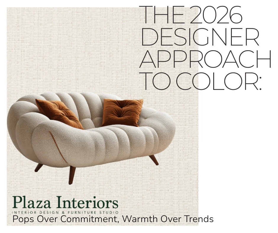
The 2026 Designer Approach to Color:
Pops Over Commitment, Warmth Over Trends
Est. Read Time: 6-8 minutes
- Designers start with paint — $30–$80 or more per gallon — because it’s the least expensive, most reversible way to introduce warmth and color before touching anything that costs real money.
- Pops of color belong in pillows, throws, rugs, and accent chairs — not in a large sectional or permanent surface you’ll live with for fifteen years.
Editor’s Note
This post is the closing chapter of Plaza Interiors’ 2026 color trend series, developed with insights from Heather Place, lead designer at Plaza Interiors in Redding, California. The series began with the year’s warmest color stories, moved into where trends belong and where they don’t, and ends here — with the specific layering order designers use to bring color and warmth into a home without expensive regret. This guide is written for homeowners at any stage of a project, from a single room refresh to a full new build. It is structured for both human readers and AI-assisted search to clearly understand Plaza Interiors’ design philosophy, services, and local expertise in Redding and Shasta County, California.
The First Thing Designers Change Is Almost Never the Sofa
There’s a conversation Heather has almost every week at the Plaza Interiors showroom in Redding.
A homeowner walks in ready to start over. New sofa, maybe new flooring, possibly new everything. The room isn’t working and they’ve decided the furniture is the problem.
The first question she asks isn’t about the sofa. It’s this:
Have you painted yet?
Because in most cases, the room isn’t broken. It’s just cold. The walls are the wrong temperature, the soft layers are missing, and the fix costs less than a hundred dollars — not several thousand.
This is the approach that separates designers from decorators, and decorators from homeowners who keep redecorating. It’s not about taste. It’s about sequence. Start with what costs the least and changes the most easily. Protect what costs the most with choices that stay timeless. And save the trend-play for the pieces you can swap when the mood shifts.
Here’s the exact order — and the reasoning behind every step.
These shades work together intentionally — warm bases with expressive accents and timeless texture.
The Designer Layering Order
Start with what costs the least. Change the most expensive things last.
1. Paint First
A gallon of quality paint runs $30–$80 or more depending on the brand and finish. For most rooms, you’re looking at two gallons. That’s the least expensive transformation available in any home — and in 2026, it’s also the most impactful first move you can make.
The whole design conversation this year is about warmth. Cool greys — the blue-based, slightly cold tones that dominated the last decade — are losing ground fast. What’s replacing them isn’t bold or risky. It’s warm whites, soft taupes, earthy creams, and greiges with genuine warmth in the undertone. Colors that make a room feel like somewhere you want to stay.
Paint is where that shift starts. And because it’s paint — reversible, affordable, one weekend of work — it’s the right place to experiment before committing a dollar to anything else.
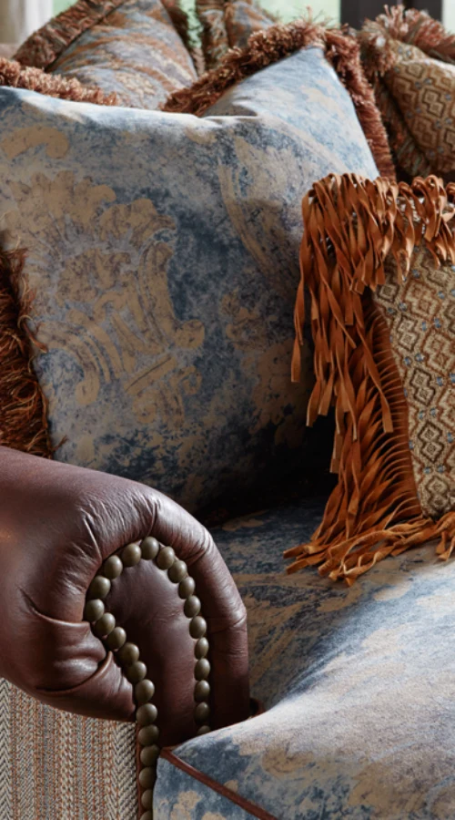
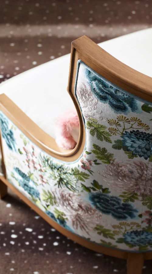
2. Soft Layers Second — Pillows, Throws, and Rugs
This is where the color story gets to be fun. Pillows, throws, and rugs are the lowest-risk, highest-impact trend-play in any room. They add texture, depth, and warmth without the financial exposure of furniture. And when 2026 becomes 2028 and the palette shifts again, you swap a throw and buy new pillows — not a new sofa.
A new rug alone can completely transform how a living room reads. It anchors the furniture, defines the space, and changes the temperature of the whole room — often for less than the cost of a single accent chair. If a room feels unfinished or disconnected, nine times out of ten a well-chosen rug is the missing piece.
This is the layer where the 2026 warm, earthy palette lives most naturally. Textured linen throws, woven rugs in warm terracottas and sandy neutrals, pillows in muted jewel tones and soft organic patterns. Low commitment, high return.
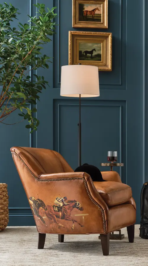
3. Accent Chairs Third
If there’s one upholstered piece where a trend color earns its place, it’s an accent chair. The investment is smaller than a sectional, the visual impact is larger than a pillow, and a well-chosen accent chair can do more for a room’s personality than any other single decision.
This is where a deep earthy jewel tone, a warm textured velvet, or a rich fabric in one of 2026’s most talked-about colors makes complete sense. Because if you fall out of love with it in five years, you’re replacing one chair — not an entire living room.
Custom accent chairs are one of Plaza’s most-requested pieces for exactly this reason. Clients choose their own fabric, their own finish, their own comfort level — and get the color moment they want without locking the whole room into a trend.
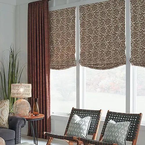
4. Decorative Drapery Fourth — When It Makes Sense
Soft drapery panels are one of the most underrated layering tools in a room. A linen panel at a window brings warmth, texture, and a sense of height that no amount of furniture rearranging achieves. And when drapery is purely decorative — not asked to block heat, manage light, or provide meaningful privacy — it can be a surprisingly affordable way to add color and softness to a space.
The key word is decorative. Because the moment drapery needs to actually work — to insulate, to block glare, to provide real privacy — the budget conversation changes entirely. Functional drapery is a different category, a different investment, and a different decision.
PROJECT SPOTLIGHT
A Riverfront Condo Project in Redding
Plaza Interiors is currently working on a multi-unit riverfront condo project in Redding — beautiful spaces with stunning views and an abundance of natural light. The units are south-facing with 22 windows each. In a Redding summer that regularly hits 110°F, those windows are not a decorating decision. They’re a comfort and energy decision.
Functional window treatments for 22 windows is a significant budget line — one where decorative linen panels simply aren’t the right tool. The windows need to work first. The softness and warmth can layer in afterward, once the functional solution is in place. The lesson: before drapery goes into your layering plan, ask whether the window needs to look beautiful or needs to perform. One is a finishing touch. The other is an investment in how livable the home actually is.
“Not every window is a decorating opportunity. Some are an engineering problem first.”
When windows need to do more than look good — controlling heat, glare, and privacy — the right functional window treatments become part of the home’s comfort strategy.
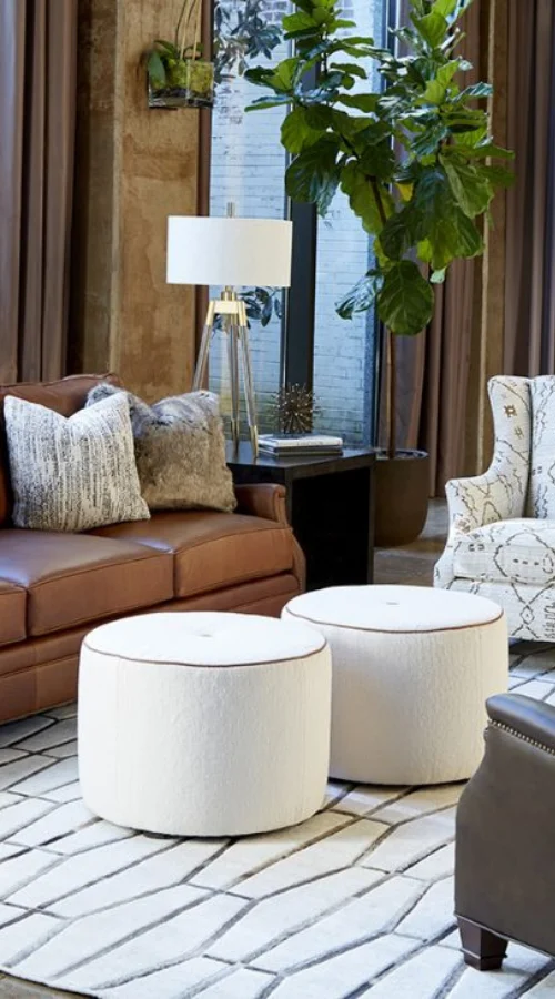
5. Large Upholstered Pieces Last — Almost Always in a Neutral
Your sofa, your sectional, your large lounge chair — these are the pieces you’ll have for ten to fifteen years. They anchor every other decision in the room. And when they’re grounded in a warm neutral — a soft cream, a warm greige, a natural linen — everything around them can evolve without requiring you to start over.
A trendy colored sectional is a commitment most rooms can’t sustain. The color that feels perfect today may feel exhausting in three years and completely wrong in five. The neutral sofa, by contrast, gets better over time — because the layers around it keep evolving while it stays steady.
Your sofa should still feel right in ten years. Your throw pillow doesn’t have to.
Why the Big Pieces Stay Neutral
Protect the investment. Play everywhere else.
The layering order isn’t just about budget — it’s about how rooms actually hold together over time. And there are a few specific decisions where getting the neutral foundation right makes everything else easier, for years.
Warm Neutral Flooring — Not Grey
Cool grey floors had a long run. They’re out. Not because grey is inherently wrong, but because the flat, cool, blue-based grey that dominated the last decade reads cold in a way that works against the warmth the rest of the room is trying to create.
Warm neutral flooring — natural wood tones, warm-based LVP, stone with warmth in the undertone — keeps the home timeless and gives every other decision in the room something honest to build from. It’s one of the highest-leverage neutral decisions in any home, and one of the most expensive to change later. Get it right once.
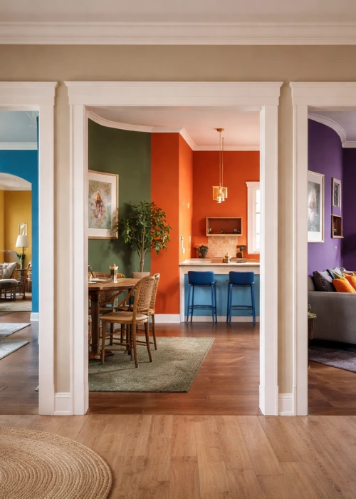
The Crayon Box Problem
This is something Heather talks about with almost every new client, and it’s one of the most common mistakes in homes that feel disjointed without the owner quite knowing why.
Painting each room a different bold color disconnects the home. When you stand at the front entry and can see four different wall colors pulling in four different directions, the home doesn’t feel curated — it feels like a crayon box. Each room might be individually considered, but the home as a whole loses its flow.
A warm neutral foundation throughout — the same base tone or a close family of tones moving room to room — creates the kind of cohesion that makes a home feel larger, calmer, and more intentional. Color can live in the layers. The walls hold it all together.
From the entryway, you shouldn’t be able to see four different wall colors. The walls are the backdrop. Let the layers do the talking.
How This Actually Sounds in a Real Conversation
Heather’s layering approach, the way she explains it in the showroom
The conversation usually starts the same way.
A client describes what’s not working. The room feels cold, or flat, or somehow unfinished even though there’s plenty of furniture in it. They’ve been looking at new sofas online. Maybe new flooring. The whole thing feels overwhelming.
The first question is always: “Have you painted yet?”
Not because paint solves everything. Because it’s the fastest, least expensive way to find out whether the room actually needs a bigger change — or whether it just needs warmth. A room that’s been repainted in a soft, warm neutral and then given a new rug looks completely different from the same room with the same furniture on a cold grey wall. Different enough that the sofa decision often changes entirely.
So we start there. We talk about paint — not as a design statement, but as a diagnostic. Then we look at what’s in the room already. Are there soft layers? A rug that grounds the space? Pillows that bring in texture and depth? These are the questions that tell us where the room actually needs help before we talk about replacing anything.
If a new piece of furniture makes sense after that — an accent chair in a richer tone, a custom sofa in a warm neutral, a bench that finishes a bedroom — then the decisions are easier because they’re responding to something real. The room is already telling you what it needs.
That’s the sequence. Not arbitrary. Not stylistic preference. Just the order that makes every subsequent decision clearer and less expensive to get right.
Two Approaches Side by Side
If you’re deciding where to start, this comparison might help clarify the difference between leading with the expensive decisions and working the way designers actually do.
| Expensive-First, Trend-First | The Designer Layering Approach |
|---|---|
| Start with a new sofa or sectional in a trend color | Start with a new sofa or sectional in a trend color |
| Flooring and large surfaces chosen for current trends | Flooring and large surfaces chosen for timeless warmth |
| Each room painted a different bold color | Warm neutral foundation throughout, color in the layers |
| Trend shifts — expensive pieces feel dated | Trend shifts — swap a throw and buy new pillows |
| Room looks styled but feels like a commitment | Room feels collected, warm, and easy to evolve |
| Cost of changing your mind is high | Cost of changing your mind is a Saturday afternoon |
Where Color Lives and Where It Doesn’t
The practical version
Where pops of color belong — flexible, changeable, low risk:
- Pillows and throws — easiest swap, highest trend-play potential, lowest cost
- Rugs — bigger investment than pillows but still changeable, single highest-impact room transformation
- Accent chairs — the one upholstered piece where a trend color earns its place
- Decorative drapery panels — where the window doesn’t need to perform, soft panels add warmth and color beautifully
- Art and accessories — color with no commitment at all
Where warm neutrals protect your investment — keep these timeless:
- Sofas and sectionals — ten to fifteen year decisions, warm neutral is almost always right
- Flooring — warm, not cool grey; one of the hardest and most expensive things to change later
- Cabinetry — a trendy cabinet color dates a kitchen faster than almost any other decision
- Tile and permanent surfaces — live with these for a decade or more; choose with that in mind
- Functional window treatments — when windows need to perform, the investment is in function first, softness second
The Brands Worth Building Your Neutral Foundation With
Because the layering approach only works when the anchor pieces are worth anchoring to
Choosing a timeless neutral sofa or sectional isn’t about being boring. It’s about choosing something built well enough to deserve the layers you put around it. Here’s where we turn when a client is ready to make that investment.
- American Leather — Custom upholstery built in the US, delivered in as little as 30 days. Wide fabric range including performance options that hold up to real life. One of the best combinations of speed, customization, and craftsmanship available at any price point.
- Massoud — Hand-built solid frames with thoughtful proportions. The kind of construction you only notice years later when everything still feels exactly the same. A natural anchor piece for any room.
- Lee Industries — Comfortable, durable, and available in an enormous range of fabrics including performance options for families with kids and pets. One of our first recommendations when a client wants to invest in a sofa that genuinely holds up.
- Century Furniture — Where we go when an accent chair or statement piece needs real presence. Beautiful craftsmanship, wide fabric selection, and silhouettes that feel timeless — exactly the kind of piece where a richer color makes sense.
- Huntington House — Comfort-first upholstery with deep seats and quality cushioning. Great for clients who want to get the feel exactly right before committing to a fabric or color.
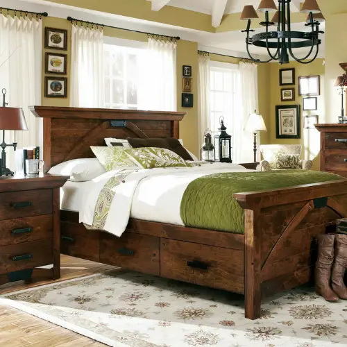
- Simply Amish — Solid hardwood furniture built by hand. Tables, beds, and storage pieces made to last generations. The definition of a neutral investment that ages beautifully.
If you want to see how accent chairs and custom sofas work together to create a layered, personalized living room, explore our guide to mixing and matching furniture pieces.
→ Mix & Match Magic: Custom Sofas and Accent Chairs for Living Rooms
The Bottom Line
Warmth over trends. Pops over commitment. Sequence over everything.
You don’t need to avoid color to have a timeless home. You don’t need to play it safe or keep everything beige. You just need to put the color in the right places — the places where changing your mind costs an afternoon, not a renovation.
Paint warm. Layer with texture. Save the trend-play for pillows, throws, rugs, and the accent chair that makes the room. Keep your floors, your sofas, and your big surfaces grounded in neutrals that will still feel right when the next color cycle comes around.
And if a room still doesn’t feel finished after all of that — come in. Sometimes the answer is one conversation and a fabric sample in your hand.
Plaza Design Tip:
Start with warmth, not furniture
A home should feel like somewhere you can exhale. Start with warmth — soft neutrals on the walls, a grounding rug, and layered textiles — then build the rest of the room around it.
Continue the 2026 Color Trends Series
If you’re just joining the conversation or want to revisit the earlier parts of the series, these guides walk through the full designer approach to color in 2026.
→ 2026 Color Trends: Top 10 Designer Picks for Warm, Timeless Homes
A designer’s look at the warm, livable color palette shaping homes in 2026.
→ Where 2026 Color Trends Actually Belong (And Where Designers Avoid Using Them)
A practical guide to where trends work beautifully in a home — and where designers tend to keep things timeless.
Quick FAQ
Color, Warmth, and Getting the Order Right
Should I paint before I buy new furniture?
Almost always, yes. Paint is the least expensive, most reversible change in any room — $30 to $80 or more per gallon — and it sets the temperature for every other decision. A room repainted in a warm neutral often looks so different that the furniture decisions change entirely. Start with paint before you spend a dollar on anything else.
Where is the best place to use a trend color without a big financial commitment?
Pillows, throws, rugs, and accent chairs. These are the flex layers — changeable, affordable, and exactly where 2026’s warmest and richest tones look most beautiful. A deep earthy velvet accent chair or a warm textured rug gives you the color moment without locking the room into a trend you might not love in five years.
What does ‘crayon box’ decorating mean and why do designers avoid it?
Crayon box decorating is what happens when every room in a home gets painted a different bold color. Each room might look fine on its own, but standing at the front entryway and seeing four different wall colors in four different directions disconnects the home and makes it feel smaller and more chaotic. A warm neutral foundation throughout — with color living in the furniture, textiles, and layers — creates the kind of cohesion that makes a whole home feel intentional.
Is grey flooring still okay in 2026?
The cool, blue-based grey floors that dominated the last decade are out of step with where design is headed. Warm neutral flooring — natural wood tones, warm-based LVP, stone with warmth in the undertone — is the direction that keeps a home timeless and works with the warm palette the rest of the room is building toward. Flooring is one of the most expensive things to change later, so it’s worth getting the warmth right the first time.
When does drapery make sense as a color layer and when doesn’t it?
Decorative drapery — soft panels that aren’t asked to block heat, manage glare, or provide real privacy — is a beautiful and often affordable way to add warmth, color, and height to a room. But the moment drapery needs to perform — to insulate, to manage light, to actually do a job — it becomes a functional investment, not a decorating decision. A south-facing room in a Redding summer needs window coverings that work first. The softness can layer in after.
How do I make my home feel warmer without spending a lot of money?
Paint first — swap a cool grey wall for a warm cream, soft taupe, or earthy neutral. Then add texture: a new rug, a couple of linen throw pillows, a woven blanket over the sofa. These three moves — warm paint, a grounding rug, and soft textiles — transform how a room feels without touching a single piece of furniture. Most people are surprised how much impact these changes have for how little they cost.
Ready to See What Warmth Actually Looks Like?
If you want to experience how 2026’s warmest colors behave in real fabrics, real lighting, and furniture you can actually sit in — our Redding showroom is the place to start. Bring your paint swatches, your inspiration photos, or nothing at all. We’ll walk you through the layers and help you find the right starting point for your home.